I Found a Penny Today, So Here's a Thought
|

|
|
|
|
|
|
According to Plato, a particular bicycle with two wheels missing is distinct from the abstract form of Bicycle-ness. A Bicycle is the ideal that allows us to identify the distorted reflections of bicycles all around us. --- Sara Luz wrote: Good old Plato. He knew what he was talking about.

Platonic idealism photographed by Melita Dennett on Church Street, Brighton.
|
|
|
|
|
|
|
To the dim-lit shore of the mind Strange things come drifting When the tide is high. —Emmy Veronica Sanders, " Driftwood" |
|
|
|
|
|
|
  by pootjThe Search for Silent ColorsWe all know garishly loud colors when we see them. Typically in the range of red, orange, and yellow, loud colors are unwelcome in business attire, unless one's business happens to be the circus. And we all know quiet colors by their instant calming effect. The quiet range of blue, green, and violet is beloved by home designers. But what of silent colors? If they exist, would we find them in cloistered monasteries, or hushed libraries, or ruined castles? The American ornithologist Roger Tory Peterson found a "sea of silent colors" when he tearfully witnessed the grandeur of the Grand Canyon for the first time. He reported a vivid array of silent reds, yellows, grays, and lavenders ( Wild America, 1997).  by davidanthonyporterThe poet A. F. Moritz found silent colors within the curves of a white seashell. He described a "diminished spectrum" of "shades of milk" ("You, Whoever You Are," Early Poems, 1983). The naturalist Timothy Duane found "the silent colors of winter" blanketing the Sierra mountain chain ( Shaping the Sierra, 2000). When feminist activist Ginny Foat found herself incarcerated, she discovered silent grays, blacks, and greens in the steel and cinder blocks of her cell ( Never Guilty, Never Free, 1985). [Read the entire article in my guest blog at ColourLovers.com.]
|
|
|
|
|
|
|
"Once more I wondered, as I had the first time I saw him, why these handsome features didn't add up to a handsome face." — Zeruya Shalev, Love Life (2001) |
|
|
|
|
|
|
The best place to learn long division is at a multiplication table. |
|
|
|
|
|
|
 by Raf ArtistaHow to Create Sublime ColorsWhat color is so awe-inspiring, so out-of-this-world that it elevates viewers to new heights of wonderment? The quest for the sublime color is as old as pigment and likely older still. Imagine the first humans to witness a majestic sunrise. They’d have had a transcendental experience, in that sublime colors open a window into a realm of grandeur beyond mere human experience. Imagine the first artists experimenting with dyes like alchemists in search of the Philosopher’s Stone, driven to discover the secret of sublime color and to possess the power to turn the ordinary into something extraordinary. Sublime colors are commonly described as being: - incomparably beautiful
- exquisite
- cheerful
- timeless
- soft
- active
- natural (sunrise, clouds, rainbows, mountains, or sea, for example)
- radiant
- sentimental
- magnificent
- glorious
- lofty, divine (in that they foster a spiritual experience)
- shimmering
Ultraviolet and deep indigo are often called sublime, and black more so. Color expert Benjamin Jan Kouwer notes that Western culture once hailed yellow as a sublime color with a favorable symbolic meaning (Colors and Their Character, 1949). Color mixers usually discover sublime beauty by accident, but art teacher Gabriel Boray suggests that artists can hone their sense of the sublime through careful practice. Boray developed a system for sublime color mixing. Through his system, colorists learn to feel when a color is “singing.” Boray instructs the colorist to begin with two complementary colors of the same temperature (such as a warm yellow and a warm ultramarine). “Mix 5 variations between them, from yellow-green to blue-green, paying careful attention to separating them enough to be recognized as a unique variation.” By adding a tiny amount of blue into the yellow, then a bit more, and more again, each variation will be distinct. “After you have 5 clear color variations between those two, create one in between each (there may be many more than one), until you have 10 variations. Now look at those colors. Are they clean and unique? They should be singing. If they aren’t singing, you are to immediately find the correct light to see the variations properly, or rush outside, close your eyes, and take 10 deep breaths while telling yourself you are a master of color! If the colors exist—and an infinite amount of colors exist—then you can identify them.” Boray assures that “When you open your eyes you will see nature as you may never have before. Return to your exercise, choose two more colors and continue. Combine as many pairs of colors, creating 5, then 10, or more variations. Gradually you will begin to feel the changes in your blood. Go outside again and look at something in nature. Make a ring with your thumb and forefinger and look as if through a magnifying glass. See the infinite variations. The same colors you see are available to you for painting. There is no barrier between your mind and your brush.” [Read the entire article in my guest blog at ColourLovers.com.]
|
|
|
|
|
|
|
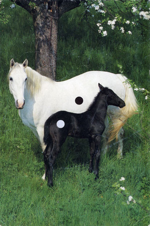
 by superdoveBlonde Pony Tails: The Human-Horse ConnectionHumans have been fascinated by white horses for millennia. Geneticists have now pinpointed the "genetic architecture" that connects blonde manes in people and equines. The study of white horses goes all the way back to ancient Rome, where depigmented horses were identified as "candidus" (white) or "glaucus" (gray). The PLoS Genetics journal notes that two thousand years ago, the white horse was held sacred by the Saxons. It served as an augur for the German tribes, its behavior considered a sign of divine approval or disapproval. The white horse was so revered that it featured on the flags of Lower Saxony and North Rhine-Westphalia. Even earlier, white horses were celebrated by the Celts in Great Britain. The White Horse of Uffington (Oxfordshire, England) is Bronze Age hillside artefact, dating back approximately 3,000 years. The figure of a 374-foot long horse (perhaps representing the Celtic horse goddess Epona) was cut into the soil, its white coat naturally pigmented by the chalk beneath the turf. The PLoS Genetics journal points out that most white horses carry a "graying-with-age mutation." They are born with a solid-colored coat which turns white by age of four to six. However, occasionally a pony is born with a solid white coat. Take, for example, the solid white mare named Cigale, born in 1957 out of solid brown parents from the Swiss Franches-Montagnes Horse population. Geneticists have studied all of Cigale's white-born descendants and isolated an inherited mutation in their pigment forming cells. Different horse populations, such as white Thoroughbreds, Arabians, and Camarillo White Horses, reveal independent pigmentation mutation events. In other words, the white horses in each equine family exhibit their own special brand of mutation leading to their white coats. But the common chromosomal factor appears to be what geneticists call the KIT gene, responsible not only for white horses but also for blonde people. White horses appear in the religious literature of many lands. Here's a small sampling: - In the New Testament's Book of Revelation, one of the four horsemen of the Apocalypse rides a white horse.
- In Japan, the white horse is a Shinto symbol of purity and divine authority.
- In Islam, the Prophet ascended to heaven on the back of a white horse.
- In Hinduism, the god Kalki rides a white horse while brandishing a comet-like sword.
- In Nordic lore, the god Odin rises a white horse named Sleipnir.
- In Greek mythology, the white and winged Pegasus sprang from the blood of Medusa when Perseus decapitated her.
[Read the entire article in my guest blog at ColourLovers.com.]
|
|
|
|
|
|
|
 by TzatzikiTeardrops as PrismsIntense moments in life can bring tears of both joy and pain. There can also be tears of something that transcends bodily feelings and emotions. These are tears of realization, when a union of some sort transforms into communion, or a passion transforms into compassion. "Bliss" might be the best word for this tearful state of being, though words are too limited. One way to inspire such tears is to look deeply into someone's eyes and to hold the gaze. A friend once shared the insight that teardrops are prisms, reflecting and refracting angles and colors of life that can't be seen with dry eyes. Mozambique author Mia Couto suggests that tearful eyes are liquid conduits to the world of the unconscious, and that through the prism of a teardrop you can see visions of things not as you wish they were but as they really are. It's as if teardrops dissolve away one's defensive walls to reveal the archetypes dwelling in the background, the mythology taking place beneath the surface of the workaday world. Throughout the ages, the joys, pains, and revelations of life have invited artists to gaze through teardrop prisms and to share their visions. [Read the entire article in my guest blog at ColourLovers.com.]
|
|
|
|
|
|
|
"Horses are, in fact, natural Taoists. ... Taoism is best known in popular culture for the 'yin-yang' circle, its two interlocking tadpole-like symbols representing the balance of opposites in the universe and in the human psyche: white and black, light and dark, sound and silence, doing something and doing nothing. To the relentlessly assertive, patriarchal Western mind, the Taoist picture of reality at first appears contrary to everything we believe because it asks us to consider the opposite of our normal inclinations. One of the most famous quotes from the Tao Te Ching advises us to 'know the yang, but keep to the yin,' which often appears in translation as 'know the masculine but keep to the feminine.' When I was with horses, I began to live this philosophy." — Linda Kohanov, The Tao of Equus |
|
|
|
|
|
|
 by Claire L. EvansUnusual Color WheelsThe first color wheel (a.k.a. color circle) has been traced back to Sir Isaac Newton, who in 1706 arranged red, orange, yellow, green, blue, indigo, and violet into a natural progression on a rotating disk. As the disk spins, the colors blur together so rapidly that the human eye sees white. Artists have been experimenting with color wheels ever since, finding inspiration in everything from cocktail umbrellas, river rocks, autumn leaves, pencil shavings, to juggling. The Happy Hour color wheel consists of exotic cocktail umbrellas. It was created by Bright Lights Little City: 
The Rocks color wheel is a collection of stones from Salmon River, Idaho. It was assembled by Purl Bee: 
This Yarn Skeinlet color wheel features dyes made of cochineal (ground up cactus-eating scale insects), osage orange, chamomile, indigo and logwood. It was created by Sarah of the Blue Garter blog: 
The Circle of Life color wheel was created by Thalandor as a tribute to the artist Mother Nature: 
This Kusudama (Medicine Ball) color wheel was created by Origami artist Vanessa Gould: 
The Pencil Shavings color wheel was photographed by Myruby: 
This Garden Blossom color wheel is the work of Tiny Haus: 
The Juggler color wheel was painted by Kenneth Callicutt: 
The Chalk color wheel was photographed near Parc De La Villette, Paris, by Jacobz: 
[Read the entire article in my guest blog at ColourLovers.com.]
|
|
This photo is entitled "Blinded by Money," but we'd say this guy has 20/20 vision.
|
|
|
|
|
|
|
 by SpookygonkMigraines That Erase Color
Chronic pain has its own devastating side effects, even in the absence of medication. Sufferers of migraine headaches sometimes report a phenomenon that amounts to color-blindness. Jeff of the Omegaword blog explains that chronic pain has a peculiar way of removing color from the world. He poetically describes his experience of a reality in which all color has been erased by bursts of red: "Red has never been my favorite color. Bolts of hot pain sear the world, leaving me colorblind but for the shards that stay behind — jagged red reminders of pain past, and pain yet to come. Through the window, beyond the mute interplay of light and shadow on a white kitchen wall, bare branches against a pale sky remind me that it's all in my head. What color are light waves, anyway?" A new study of synesthesia confirms Jeff's observation that the color of the world is all in one's head. Cretian van Campen, author of The Hidden Sense: Synesthesia in Art and Science (2007), explains: "A mysterious aspect of color is that it is created in the brain and seen to exist in the physical environment. But the physical environment contains only light waves and is in fact colorless. The colors are inside our brains, not outside." Color palettes sometimes testify to hues that have been displaced or erased by profound circumstances. For example, COLOURlover Codename Gimmick envisions the frosty onset of winter as a time when "frequencies from red to yellow have been silenced." His "Frost-Over" palette celebrates red and yellow through their striking absence. 
With the palette "Another Migraine?" COLOURlover Stefan depicts a reality reduced to lavender, punctuated by an occasional throb of neon yellow. 
COLOURlover Manekineko envisions a world so desaturated that only dull grays remain. 
Migraine-inspired palettes from the COLOURlovers library testify to the phenomenon that chronic pain can distort or dampen one's experience of color. Luckily, some artists seem able to retain a keen color sensibility even within the confines of a migraine headache. [Read the entire article in my guest blog at ColourLovers.com.] --- Gia writes: Interesting. Migraines are just the opposite to me. Imagine the brightest yellow, neon +++++, electrified, magnified, and shot directly to your brain. Behind the eyes, a violent pink, raw, bleeding and sore. Add some touches of green—outer space green. Glowing and undulating, slowly creeping over the entire length of your body, quieting your every cell.
Yeah.
That's close.
|
|
|
|
|
|
|
 by franz66Test Your Color Memory
Is it possible to accurately remember a given color? Rochester Institute of Technology Professor Mark Fairchild says "no"! Surprisingly, the brain is poorly equipped to remember colors. At best, Dr. Fairchild notes, "we can remember only general categories of color represented by significant color names. That's why there are so many sophisticated ways to name, organize, and measure color." Here's a way to test your own color memory. Close your eyes and imagine a red stop sign at a traffic intersection. It's a color that drivers see every day in the European Union, United States, and many other places. Then open your eyes and see if you can identify the official stop sign color from amongst the following imposters:                     Answer: According to the Manual on Uniform Traffic Control Devices, the official stop sign color is HEX: #B01C2E, RGB: 176, 28, 46, Pantone® 187. It is the last color in our lineup. Did you guess correctly? Here's a second try, with fewer options. Close your eyes and imagine the giant yellow "M" of the McDonald's® franchise. It's an eye-catching yellow known the world over. Then open your eyes and see if you can identify the official McDonald's® yellow from amongst the following imposters:         Answer: According to the McDonald's® Global Logo and Trademark Standards Reference Guide, the official yellow is HEX: #FCC917, RGB: 252, 201, 23, Pantone® 123. It is the first color in our lineup. Did you guess correctly? You can explore Dr. Fairchild's research on color perception and imaging at his website. [Read the entire article in my guest blog at ColourLovers.com.]
|
Page 167 of 173
> Older Entries...
Original Content Copyright © 2026 by Craig Conley. All rights reserved.
|