|
|
|
|
|
|
|
  by GiantChess.comTaking Chess Beyond Black and WhiteThere's an age-old debate in the Chess world over whether Black or White is the "superior" color. Because White makes the first move, White wins an overwhelming percentage of the time. But what if both sides were Grandmasters? Would there still be a color advantage, or would every game end in a stalemate? The Surrealist artist Marcel Duchamp found his own way to break free of this philosophical "gray area." In 1920, he invented a color version of his favorite board game in an attempt to turn Chess into an artistic activity. Duchamp's color choices weren't arbitrary. Indeed, as Duchamp expert Francis Naumann points out, the color of each piece served as a "continuous visual reminder of its movement and strategic power." Duchamp's two Rooks were light blue and dark blue. The Bishops were light and dark yellow. As the Queen is a combination of the Rook and Bishop (in terms of power and movement), she blended blue and yellow to form light and dark green. The Knights, sharing no characteristics with other chessmen, were light and dark red. Kings were white and black, and pawns were also white and black. Naumann notes that Duchamp compared the black and white game of chess to a "pen and ink drawing," likening chess players to painters who created black and white artwork out of pre-existing forms. "Extending Duchamp's analogy," Naumann suggests, "we could then say that playing on the chromatic set would be the equivalent of drawing in color." Though eyewitnesses recorded seeing Duchamp's painted chessmen in the early 1920s, the remarkable set seems to have become lost in the mists of time. We are left only with anecdotes and our own imaginations. Today, specialty chess piece manufacturers offer a rainbow of colorful pieces for clients who wish to assemble custom sets. For example, Chaos creates pieces in purple, green, blue, red, white and black, while Giant Chess offers 16 hues including "Edelweis," "white milk," silver, vermillion, chestnut brown, Olympia gold, silver, and soft violet. [Read the entire article in my guest blog at ColourLovers.com.]
|
|
Piecing together the secret of two hearts . . . |
|
An unpowdered complexion pale as any woman’s, / Unrouged lips rosy as any maiden’s. / Eyebrows so long as to meet his eyes, / A form so delicate as hardly to bear his clothes. / A jet- black crepe- silk cap he had, / Matching his face like a crown of jade. / Bright red tapestry- silk shoes he wore, / And stepped as lightly as if walking on clouds.
—Li Yu (1610–1680), The Carnal Prayer Mat, translated by Patrick Hanan, 1990.
|
|
|
|
|
|
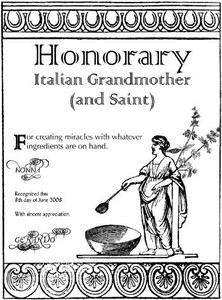
Our Honorary Italian Grandmother (and Saint) certificate generator was featured at The Generator Blog this week. Italian grandmothers are famous for being dauntless, affectionate, and inspirational. The spirit of Nonna, the archetypal Italian Grandmother, is the zest for life. Nonna is present whenever a family and guests are well fed and whenever something is created by hand, with care and love. The Honorary Italian Grandmother (and Saint) certificate is for those rare individuals with a flair for maintaining tradition, improvising without blinking, and turning anything into a nurturing experience. The certificate is personalized in fine calligraphy, easy for you to generate, and completely free! |
|
The ‘best clothes’ donned for Sunday and formal occasions might be of dark material, but daily garb ran the spectrum of colors. Russet was favored, at least in New England, but reds, yellows, blues, and greens were also common. . . .
The lively colored outfits of the first settlers became more subdued as men moved into the backcountry. As James Axtell has remarked, ‘Colonial woodsmen quickly found that for stalking wild game or enemies — or being stalked — red coats, blue trousers, and yellow waistcoats were signal failures. Far better were the forest’s natural dull shades of brown and green.’
—David Freeman Hawke, Everyday Life in Early America, 1989.
|
|
|
|
|
|
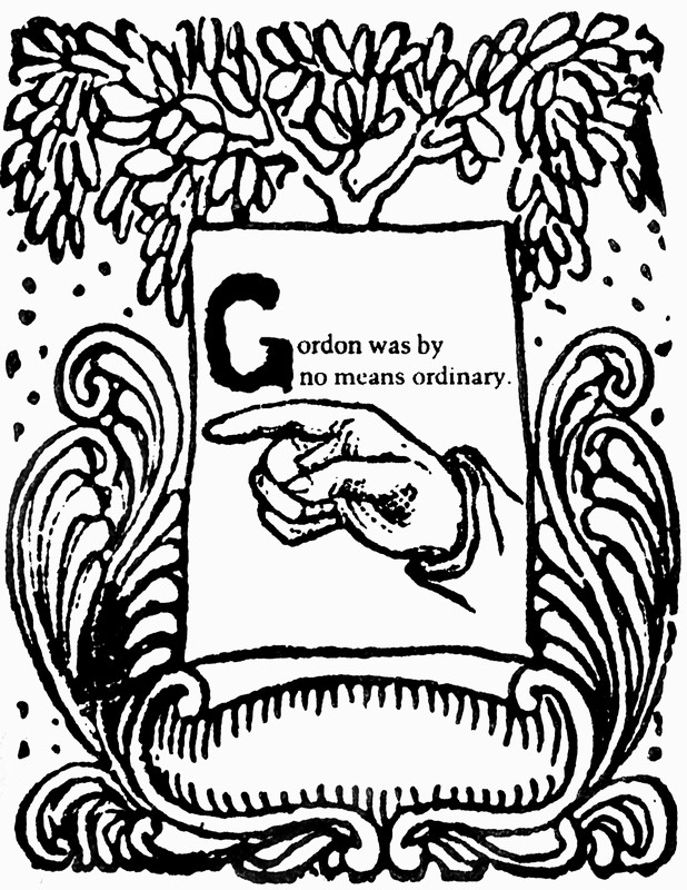
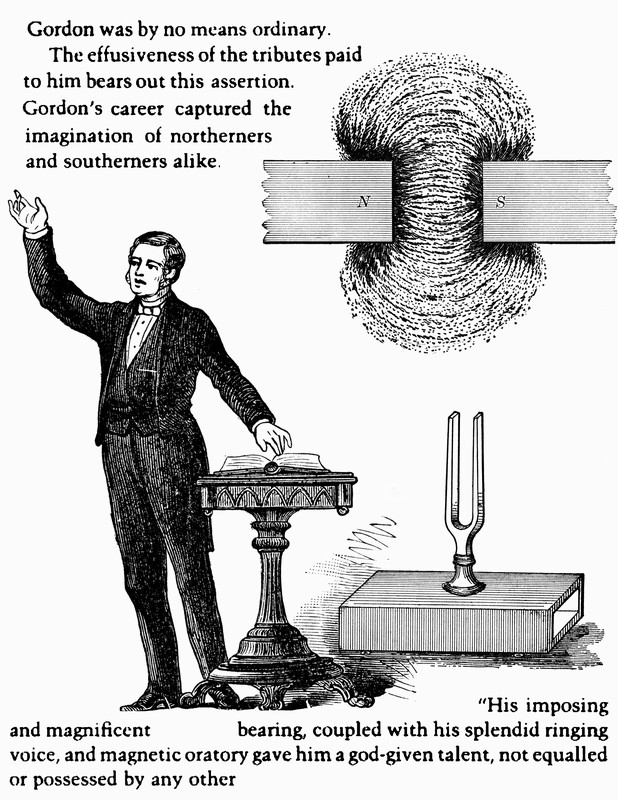
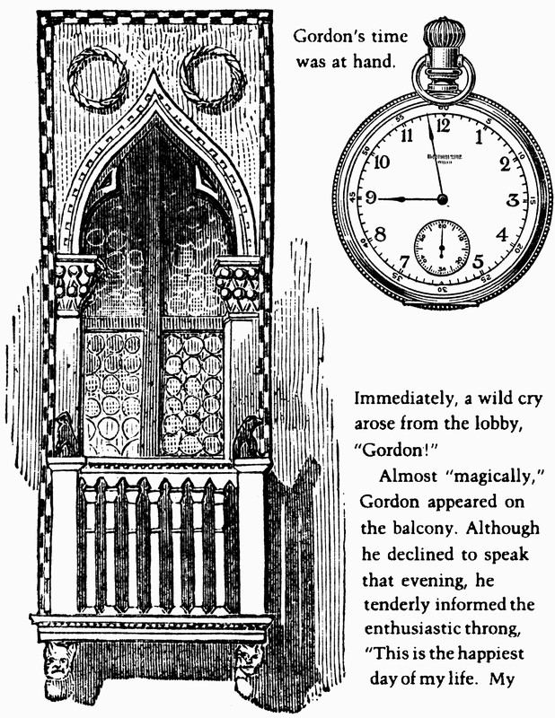
A collaged story we assembled for a singular Gordon and henceforth dedicate to all the Gordons of the world. Click on the thumbnails below to view an enlarged version in a new window.
Anthony Dhark writes: Gordon is clearly a remarkable and humble guy.
|
|
"The 'portable staircase' has long been a favourite scheme with many persons, and considerable ingenuity has been directed to this point, but hitherto without any success. Nothing sufficiently portable has yet been produced, and I fancy, never will."
—The Mechanics' Magazine, Museum, Register, Journal, and Gazette (1839)
|
|
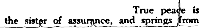
Piecing together the secret of true peace . . . |
|
|
|
|
|
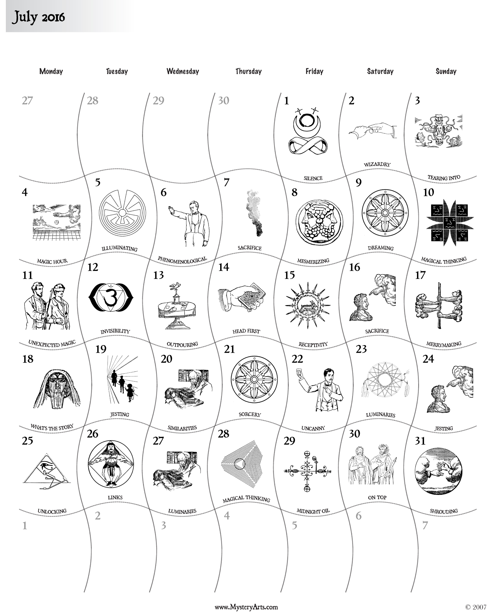
Did you know you can generate and download your own symbolic calendar each month (for free)? Visit our MysteryArts.com/magic site, scroll to the bottom of the page, and give it a try.
|
|
| I Found a Penny Today, So Here's a Thought |
(permalink) |
|
|
|
 by jovikeThe Little-Known Meanings of Crazy Color Names vol. 5
Baffling color names often tell entertaining stories, at least to those who are willing to delve beneath the surface. We continue our strange and wonderful adventure into the uncharted fringes of language, where we'll discover new "shades of meaning." The deep green color called nnnn represents a “closed,” “intimate” hummed sound which “resonates mostly in the head,” as opposed to the “exposed” aaahh sound “which resonates in the chest. You can keep the closed sound a secret, sitting calmly at a committee meeting while others about you are losing their minds” (W. A. Mathieu, The Musical Life). 
The light gray color claled nnnnnn refers to the “head guy” of “a bunch of dudes from the nameless planet”: "Nnnnnn moved his green hand in a circle, indicating the stream, the forest, the city. 'I know you feel like an alien here,' he said softly. 'But that is because you are thinking too small'" (Bruce Coville, “I, Earthling,” Odder Than Ever). 
The deep blue color called nt represents the word not, written in Roger Bacon’s all-consonant secret code (devised in 1250), as discussed in The Voynich Manuscript by Gerry Kennedy. 
The tan color called pff is an indication that one is miffed, as by a failed pursuit: "[W]hen they rounded the corner the bird had disappeared, and though the children searched high and low, there was not a feather to be found. 'Pff! Typical,' Georgie spat, turning back down the stairs" (Justyn Walker, The Magician’s Daughter). 
The pink color called pfff refers to a French expression of loneliness, as when everyone is having too much fun to give one a call, as in “Numéro privé” by Erwan Le Goffic. 
The magenta color called pfffft recalls the sound of a stabbing hypodermic needle: "She stuck the needle in, pushed pfffft, just like that, and it started burning immediately" (Janet Laurel, Heart and Soul: What It Takes to Promote Health While Confronting Cancer). 
The light mauve color called pffft echoes the sound of a balloon deflating: "The volunteer was given a pair of safety glasses and a long bamboo pole to the end of which was secured a match. This was lit, and placed under the balloon. It collapsed with a dull pffft" (D.W. St. John, A Terrible Beauty). 

by Chebbs
The light blue color called phhhh refers to a dismissive expression: "Nobody calls me on the house-phone line, not now that I’ve got my cell phone. Phhhh, I’m not answering it" (Grace Dent, LBD: It’s a Girl Thing). 
The bright green color called pp means pianissimo (a musician’s directive to perform a passage very softly). 
The bright red color called ppp echoes a French expression (usually accompanied by a shrug) meaning “beats me,” as discussed in Street French Slang Dictionary & Thesaurus by David Burke. 
All of these color name insights are derived from my Dictionary of Improbable Words, which is available for online reading. [Read the entire article in my guest blog at ColourLovers.com.]
|
|
|
|
|
|
| I Found a Penny Today, So Here's a Thought |
(permalink) |
|
|
|
Lord Whimsy ponders the decline of the necktie: As if trying to look "casual" wasn't just an uglier kind of affectation! To do away with such baseline standards of adult dress is the illusion of freedom, a lame gesture that leads to even more restrictive mores. Adolescent-minded Boomers won't be satisfied until the only socially acceptable way to present oneself is to dress like a six year-old. And when that day comes, none of us will feel free--just undignified and infantilized. Given the choice, I'd rather be coerced into looking like an adult than a child.
Much is made of the idea that not wearing a tie allows for more self-expression, which is idiotic. Not wearing a tie says "I'm not wearing a tie," and little else. Wearing a tie--with its endless palette of colors, knots and patterns--is where the expression lies. Like Wilde said, "A mask says far more than a face."
See Lord Whimsy's full discussion here.
|
|
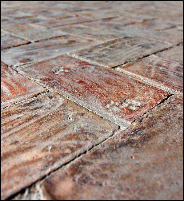
Saint Tabby
Patron of Meditating Cats
"The radiation of peace and calm by the sages is reflected in a meditating cat," said C. Sivaramamurti.
Saint Tabby loved to quip that her only two vices were pride and litter: a pride of cats and a litter of kittens, that is. She so adored cats that even her prayers sounded like purring. (The purrs were actually a form of throat singing, also known as overtone chanting, which Saint Tabby learned while on retreat in Tuva.) Legend has it that when she knelt in prayer on the ancient brick cloister of San Michele a Ripa, she left behind a set of holy pawprints.
|
|
|
|
|
|
|
|
The visual poet extraordinare Geof Huth has been "defining shapes." Some favorite examples: … three reasons to suspend disbelief
∞ a conclusion of forever
* a star in the mind
? the hook that catches
- a stitch of text
) the end of whispers
{ a crumpled page
! surprising the ending
\ the path to
: two eyes that follow
; two eyes and one grain of sand
^ the hat of the missing
$ the sibilance of sermons
` a grave way of speaking
• dividing the string into threads
† the graveyard of the second thought
§ the pregnancy of sections
For many more, see Geof's " Defining Shapes." Also see Gary Barwin's equally enchanting " Anus Porcupine Eyebrow." |
Page 3 of 4
> Older Entries...
Original Content Copyright © 2026 by Craig Conley. All rights reserved.
|